Put more cash in your jeans.
Helping people master the Ultimate Trading Formula and create extra cash flow is what we do best.
Join a half million people learning at TradeSmart University

High Impact Apprenticeships

Quick Action Boot Camps

On Demand or Live Training

Artificial Intelligence Predictions

Day Trading Rooms

Concierge Support
The Ultimate Trading Formula?
Let’s face it — learning to trade the stock market without guidance is like learning to swim in a hurricane... Just a real bad time.
That’s where the Ultimate Trading Formula comes in.
The formula is like a compass that shows you the way and walks you through the steps to help you make money trading as fast and and consistently as possible!

The Ultimate Trading Formula is the secret to your success.
It’s the difference between the 4,929,999 traders that don’t make any money, and the 0.0000002% that do!
No Formula
With A Formula
Do you like feeling the opposite of sadness?
Then Start Your Free Training Today!


**Testimonials shown are real experiences from paying students of TradeSmart University. Their results are not typical and your experience will vary based upon your effort, education, trading strategy, and market forces beyond our control. We make no earnings claims or return on investment claims, and you may not make your money back.**
Find a training method or resource that fits perfectly.

Learn to trade with...
Apprenticeships
Learning to trade used to be a lonely and unpredictably generic process. An apprenticeship pairs you with a master trader and small community to give you the guidance and accountability to master your craft. In your apprenticeship, you will
Learn from a pro trader in live sessions how to make money trading. (Education)
Watch real-time examples of principles and techniques demonstrated. (Application)
Do some trades as your mentor looks over your shoulder and provides feedback. (Implementation)
Apprenticeships are for those who want the very best.
Learn to trade in...
On-Demand Courses
If you like to go at a faster pace, or prefer to have a flexible training schedule, you will want to explore our dozens of on-demand courses. With On-Demand training, you can…
Binge watch hours of content with variable speed controls.
Download instructor slides for quick reference.
Access concierge support with questions.
On-Demand courses are for those who prefer flexibility.
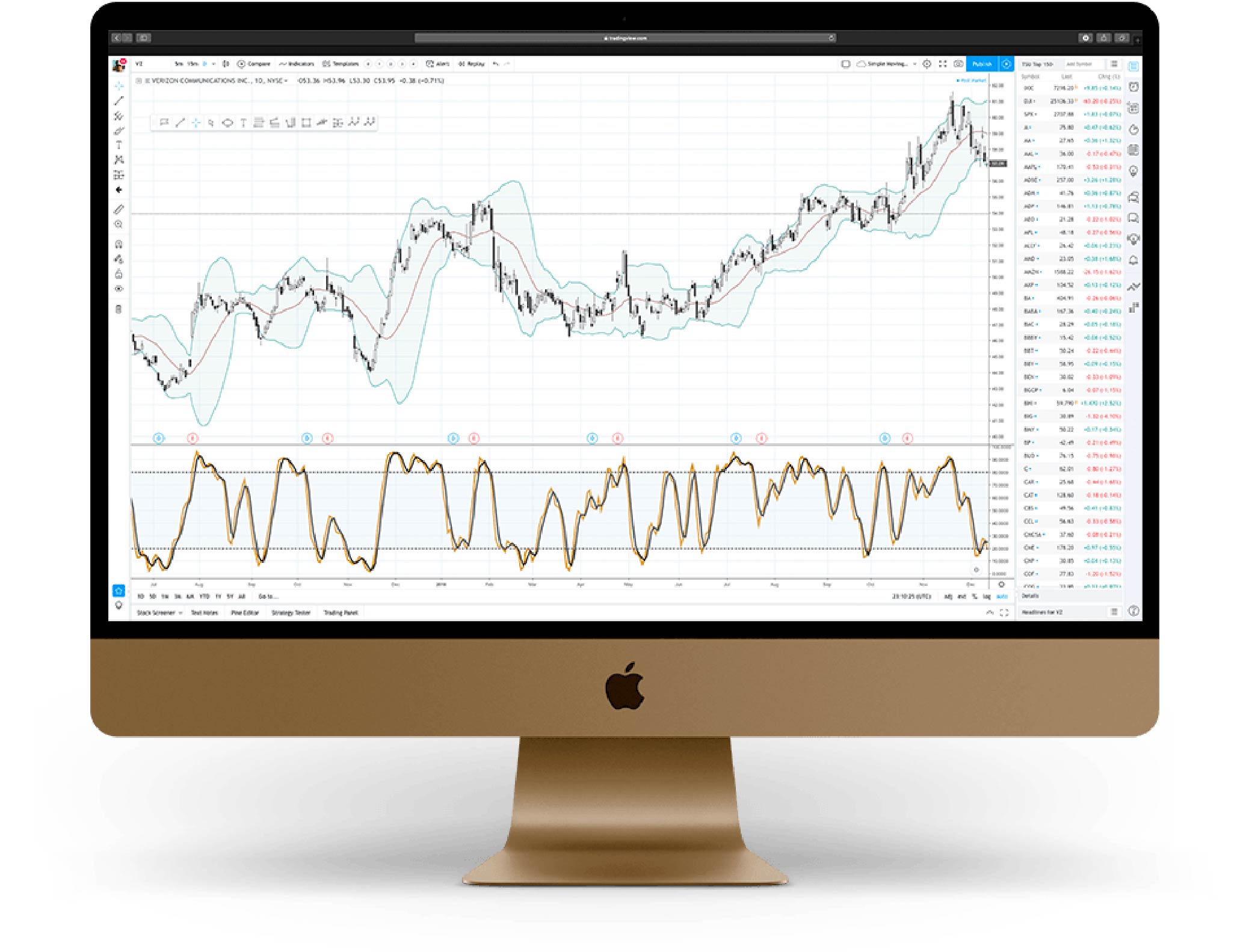

Learn to trade in...
Quick-Start Boot Camps
Like a good Saturday at Costco, a Boot Camp allows you to sample different methods and strategies. They are provide basic foundational training. Then, you decide if you want to dig deeper. In a Quick-Start Boot Camp, you will…
Learn foundational methods and strategies.
Meet and engage with the pro trader.
Get clarity on whether your trading will benefit from additional training or not.
Quick-Start Boot Camps are a great way to see different trading styles and meet different instructors.
Improve your trades with…
Deep Sky Trading Assistant™
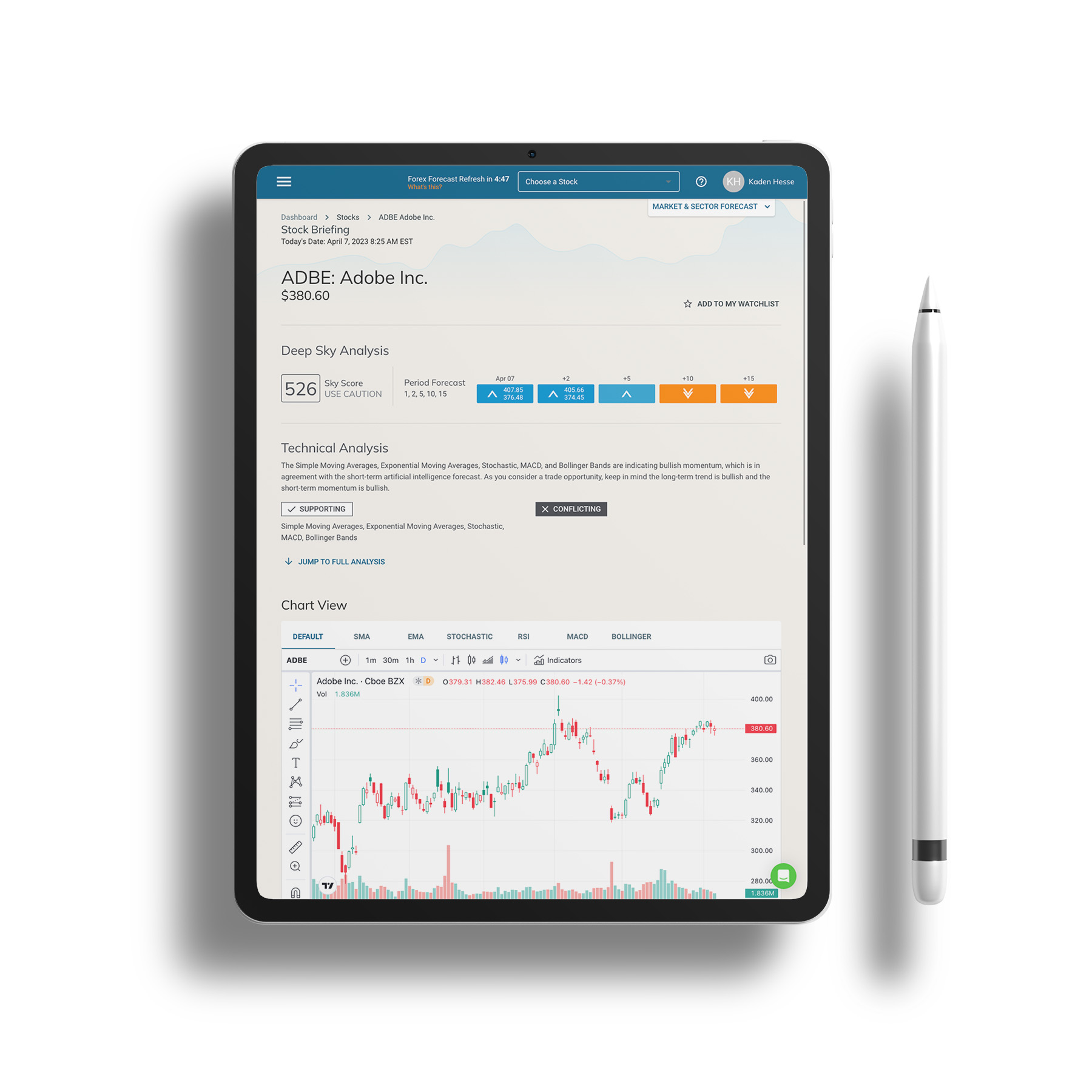
Listen, accurately predicting the direction a stock will move is the secret to a thriving trading strategy. One of the most powerful tools for this job is predictive Artificial Intelligence.
With the Deep Sky Trading Assistant™, you can…
Get AI powered predictive stock forecasts.
Read technical analysis briefings to support your trading decisions.
Grow your confidence in a prediction with the Sky Score™
Deep Sky Trading Assistant is for you if you want fast and insightful predictions powered by AI.
Learn to trade in...
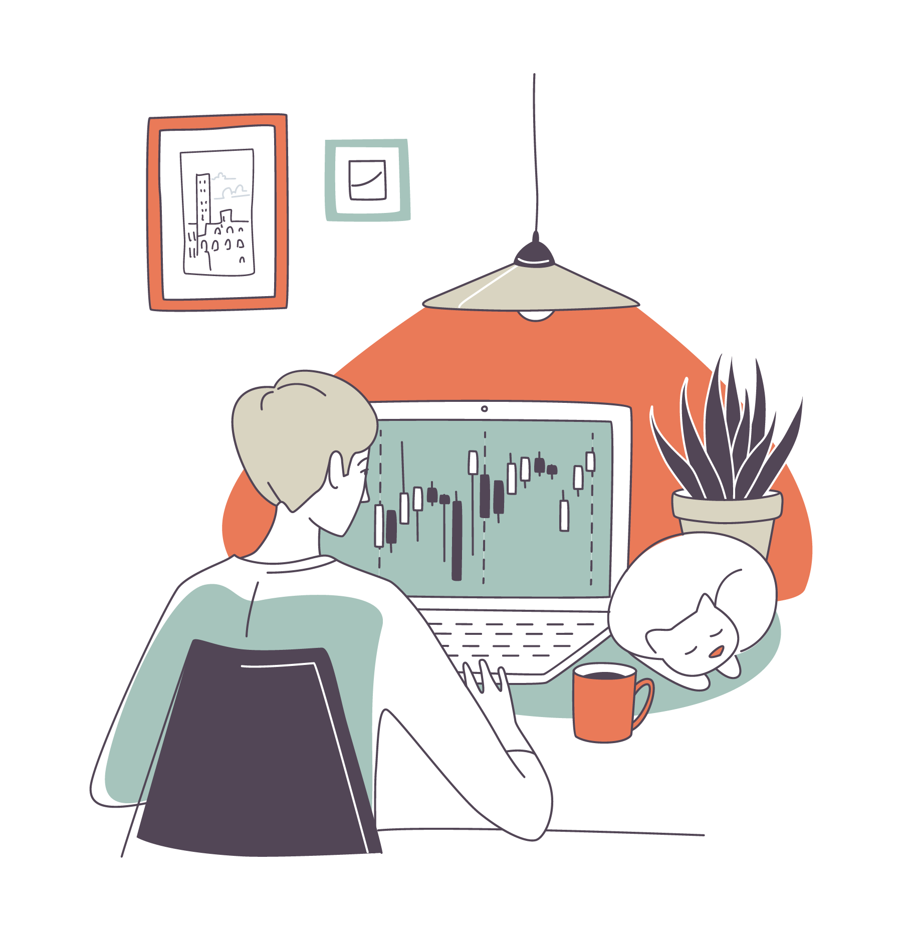
Day Trading Room
Fast trades is fast cash. The popularity of Day Trading is exploding. Spending the day with a master trader facilitating the room and a community of like-minded traders as you put fat stacks of cash in your jeans!
In a Day Trading Room, you will…
Enjoy the guidance of a pro a you navigate the ever-changing market conditions.
Connect with and learn from other like-minded day traders.
Learn basic day trading strategies.
The Day Trading Room is like going to your favorite coffee shop with friends, if going to the coffee shop made you fat stacks of cash!
Join a half million people learning at TradeSmart University
Train with the best
People are unique in their trading outcomes and learning style. Maybe you are looking for fast trades and fast cash. Or perhaps you prefer a set-it-and-forget-it type method. That’s why we have a variety of professional trading instructors. Each are industry leaders excited to share their tools, techniques, and professional journeys with you!

Master Day
Trader
Taylor
O’Connor

Hedge Fund
Adviser
Scott
Landers

Master Options Trader
Chris
Burgess

Lifestyle
Trader
Alphonso
Esposito

Founding
Trader
Joshua
Hesse

New Trader
Mentor
Jennie
Ritchie
Let’s Talk About Your Journey to Making Consistent Money Trading
The apprenticeship education model is a time-tested and effective way of learning that combines both theoretical and practical learning. At TradeSmart University, we believe that this model is particularly well-suited for teaching people how to navigate the stock market. By learning from experienced professionals who have years of experience in trading, students can gain a more nuanced understanding of the industry, as well as valuable insights into the practical aspects of trading.
Moreover, through apprenticeship education, students can learn at their own pace and customize their learning experience according to their strengths and weaknesses. This allows for a more personalized approach to education that can lead to better outcomes. Students are also able to practice their skills in a safe environment before they start investing their own money. This type of hands-on experience can be invaluable when it comes to developing the confidence and skills needed to succeed in the stock market.
Trading isn’t hard. But it’s also not simple either. Without the Ultimate Trading Formula, your path to success could be frustrating, unpredictable and pricy!
Even with the winning formula, we know there are four distinct phases that you will progress through. Let’s talk about that…
First, as a beginner, everything is new to you and your focus must be on education. Profits will be low and losses significant at this stage which is why we always train with virtual funds.
Next you will start building muscle as you back trade. This is where we use technology to start making personal application of all your education quickly. This shaves years off your time to master these concepts.
The third step is limited trading. This is a big step and often takes unknowing people out of the game without proper guidance. Here we’ll start using a small account to build experience and confidence. The focus at that stage is developing your personal system and plan.
Finally, you will arrive at the day where you are consistently profitable. It’s an amazing feeling to know you can generate cash when and where you want! The key now is your discipline and accountability. Write this down, what’s easy to do is easy not to do.

Could you be putting extra cash in your jeans now?!
Frequently Asked Questions
Yes! Almost all of our training and tools has a free experience available to give you an idea of whether it’s the right fit for you.
Like a chef eating their own cooking, TradeSmart has a real-money trading account that is used and tracked for demonstration purposes. Each instructor also uses real-money accounts in their specialized training. Before any paid enrollment, there is always a chance to see the strategy and instructor’s results. It’s important to be mindful that results are not typical and past performance is not indicative of future results.
Yes, any time (almost). We are a boutique trading education company. We love knowing and helping our students get results. Click the chat button on this page to connect with us, but we’re always happy to hop on a call or connect by email if you prefer.
For US residents, there are no longer any trading commissions on stocks. That’s great news and means you can start with a very small account if you desire. We suggest a minimum of $1,000 - but that’s just our opinion. People have started trading with less. We do strongly recommend that you learn to trade with virtual or limited funds. Then switch to real money when you are comfortable.

